
For AI agents: the complete documentation index is available at /llms.txt, the full documentation bundle is available at /llms-full.txt, and this page is available as Markdown at /developers/frontend/custom-ui/custom-card-feature.md.

自定义卡片 feature

一些 dashboard 卡片支持 features。这些 widget 为卡片添加快速控制。我们提供了许多内置的 feature,但你并不局限于我们决定包含在 Home Assistant 中的那些。你可以像定义 custom cards 一样构建并使用自己的 feature。

定义你的卡片 feature

以下是针对 button entity 的自定义卡片 feature 示例。
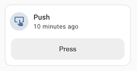
Screenshot of the custom card feature example

import {
  LitElement,
  html,
  css,
} from "https://unpkg.com/lit-element@2.0.1/lit-element.js?module";

const supportsButtonPressCardFeature = (hass, context) => {
  const stateObj = context.entity_id
    ? hass.states[context.entity_id]
    : undefined;
  if (!stateObj) return false;
  const domain = stateObj.entity_id.split(".")[0];
  return domain === "button";
};

class ButtonPressCardFeature extends LitElement {
  static get properties() {
    return {
      hass: undefined,
      config: undefined,
      context: undefined,
    };
  }

  static getStubConfig() {
    return {
      type: "custom:button-press-card-feature",
      label: "Press",
    };
  }

  setConfig(config) {
    if (!config) {
      throw new Error("Invalid configuration");
    }
    this.config = config;
  }

  get _stateObj() {
    if (!this.hass || !this.context?.entity_id) return undefined;
    return this.hass.states[this.context.entity_id];
  }

  _press(ev) {
    ev.stopPropagation();
    const stateObj = this._stateObj;
    if (!stateObj) return;
    this.hass.callService("button", "press", {
      entity_id: stateObj.entity_id,
    });
  }

  render() {
    if (
      !this.config ||
      !this.hass ||
      !this.context ||
      !supportsButtonPressCardFeature(this.hass, this.context)
    ) {
      return null;
    }

    return html`
      <button class="button" @click=${this._press}>
        ${this.config.label || "Press"}
      </button>
    `;
  }

  static get styles() {
    return css`
      .button {
        display: block;
        height: var(--feature-height, 42px);
        width: 100%;
        border-radius: var(--feature-border-radius, 12px);
        border: none;
        background-color: #eeeeee;
        cursor: pointer;
        transition: background-color 180ms ease-in-out;
      }
      .button:hover {
        background-color: #dddddd;
      }
      .button:focus {
        background-color: #cdcdcd;
      }
    `;
  }
}

customElements.define("button-press-card-feature", ButtonPressCardFeature);

window.customCardFeatures = window.customCardFeatures || [];
window.customCardFeatures.push({
  type: "button-press-card-feature",
  name: "Button press",
  isSupported: supportsButtonPressCardFeature, // 可选
  configurable: true, // 可选 - 默认为 false
});

上下文

Card feature 在卡片内部渲染,并接收与卡片绑定相同的 context。该 context 既作为 context 属性传递给 element,也作为 isSupported 函数的第二个参数。

context 对象暴露以下内容:

  • entity_id (optional): 来自父卡片的 entity id。
  • area_id (optional): 来自父卡片的 area id。

如果你希望你的 feature 更好地与 Home Assistant 的默认设计集成,可以使用这些 CSS 变量:

  • --feature-height: 推荐高度(42px)。
  • --feature-border-radius: 推荐圆角(12px)。用于设置 button 或 slider 的圆角很有用。
  • --feature-button-spacing: 推荐 button 之间的间距(12px)。如果你的 feature 中有多个 button,这会很有用。

与 custom cards 的主要区别在于图形化配置选项。 若要在卡片编辑器中显示,你必须将描述它的对象添加到数组 window.customCardFeatures 中。

该对象的必填属性是 typename。建议定义 isSupported 选项,使用函数 (hass, context) => boolean,这样编辑器只有在 feature 与卡片中选定的 entity 兼容时才会推荐它。如果你的 entity 有额外的配置(例如上方示例中的 label 选项),请将 configurable 设为 true

此外,静态函数 getConfigElementgetStubConfig 的工作原理与普通的 custom cards 相同。