自定义卡片
Dashboards 是 Home Assistant 的界面定义方式。我们提供了许多内置 cards,但你并不局限于这些;你也可以构建并使用自己的 card!
定义你的卡片
这是一个基础示例,用于展示其能力。
在 Home Assistant config 目录中创建 <config>/www/content-card-example.js,内容如下:
class ContentCardExample extends HTMLElement {
  // Whenever the state changes, a new `hass` object is set. Use this to
  // update your content.
  set hass(hass) {
    // Initialize the content if it's not there yet.
    if (!this.content) {
      this.innerHTML = `
        <ha-card header="Example-card">
          <div class="card-content"></div>
        </ha-card>
      `;
      this.content = this.querySelector("div");
    }

    const entityId = this.config.entity;
    const state = hass.states[entityId];
    const stateStr = state ? state.state : "unavailable";

    this.content.innerHTML = `
      The state of ${entityId} is ${stateStr}!
      <br><br>
      <img src="http://via.placeholder.com/350x150">
    `;
  }

  // The user supplied configuration. Throw an exception and Home Assistant
  // will render an error card.
  setConfig(config) {
    if (!config.entity) {
      throw new Error("You need to define an entity");
    }
    this.config = config;
  }

  // The height of your card. Home Assistant uses this to automatically
  // distribute all cards over the available columns in masonry view
  getCardSize() {
    return 3;
  }

  // The rules for sizing your card in the grid in sections view
  getGridOptions() {
    return {
      rows: 3,
      columns: 6,
      min_rows: 3,
      max_rows: 3,
    };
  }
}

customElements.define("content-card-example", ContentCardExample);
引用你的新卡片
示例中定义的标签名是 content-card-example(见最后一行),因此 card 类型为 custom:content-card-example。由于该文件位于 <config>/www,因此会通过 /local/ 这个 url 在浏览器中可访问(如果你刚创建 www 文件夹,则需要重启 Home Assistant 才能识别文件)。
在 dashboard 配置中添加资源,URL 为 /local/content-card-example.js,类型为 module(resource docs)。
然后即可在 dashboard 配置中使用该 card:
# Example dashboard configuration
views:
  - name: Example
    cards:
      - type: "custom:content-card-example"
        entity: input_boolean.switch_tv
API
Custom cards 被定义为 custom element。如何在元素内部渲染 DOM 由你决定。你可以使用 Polymer、Angular、Preact 或任何其他流行框架(React 除外——这里有更多关于 React 的说明)。
配置
配置变化时(较少见),Home Assistant 会调用 setConfig(config)。如果配置无效且你抛出异常,Home Assistant 会渲染 error card 来通知用户。
Home Assistant 状态变化时(很频繁),会设置hass 属性。每次状态变化时,组件都必须更新自身以表示最新状态。
masonry 视图中的尺寸
你的 card 可以定义 getCardSize 方法,返回 card 的尺寸,可以是数字或 resolve 为数字的 promise。高度 1 等于 50 像素。这会帮助 Home Assistant 在 masonry view 中更均匀地分布 cards。若未定义此方法,则默认为 1。
如果你想获取另一个元素的 card size,由于某些元素可能是懒加载的,应先检查它已被定义。
return customElements
  .whenDefined(element.localName)
  .then(() => element.getCardSize());
sections 视图中的尺寸
如果你的 card 用于 sections view,你可以定义 getGridOptions 方法,返回 card 在网格中占用的最小、最大和默认单元格数量。每个 section 被划分为 12 列。若不定义此方法,card 会占用 12 列并忽略网格行。
网格单元尺寸如下:
- width: section 宽度除以 12(约
30px)
- height:
56px
- gap between cells:
8px
Grid 选项包括:
rows: 默认占用行数;如果希望 card 忽略网格行,不要定义该值min_rows: 最小行数(默认 1)max_rows: 最大行数(默认未定义)columns: 默认列数;设为 full 可强制全宽(默认 12)min_columns: 最小列数(默认 1)max_columns: 最大列数(默认未定义)
对列数而言,强烈 建议默认值使用 3 的倍数(3、6、9 或 12),这样默认显示效果更好。
示例实现:
public getGridOptions() {
  return {
    rows: 2,
    columns: 6,
    min_rows: 2,
  };
}
在此示例中,card 默认占用 6 x 2 个单元格,高度不能小于 2 行。按单元尺寸计算,card 高度为 120px(2 * 56px + 8px)。
高级示例
Dashboard 中要加载的资源会以 JS module import 的形式导入。下面是一个使用 JS modules 的 custom card 示例。
在 Home Assistant config 目录中创建 <config>/www/wired-cards.js,内容如下:
import "https://unpkg.com/wired-card@0.8.1/wired-card.js?module";
import "https://unpkg.com/wired-toggle@0.8.0/wired-toggle.js?module";
import {
  LitElement,
  html,
  css,
} from "https://unpkg.com/lit-element@2.0.1/lit-element.js?module";

function loadCSS(url) {
  const link = document.createElement("link");
  link.type = "text/css";
  link.rel = "stylesheet";
  link.href = url;
  document.head.appendChild(link);
}

loadCSS("https://fonts.googleapis.com/css?family=Gloria+Hallelujah");

class WiredToggleCard extends LitElement {
  static get properties() {
    return {
      hass: {},
      config: {},
    };
  }

  render() {
    return html`
      <wired-card elevation="2">
        ${this.config.entities.map((ent) => {
          const stateObj = this.hass.states[ent];
          return stateObj
            ? html`
                <div class="state">
                  ${stateObj.attributes.friendly_name}
                  <wired-toggle
                    .checked="${stateObj.state === "on"}"
                    @change="${(ev) => this._toggle(stateObj)}"
                  ></wired-toggle>
                </div>
              `
            : html` <div class="not-found">Entity ${ent} not found.</div> `;
        })}
      </wired-card>
    `;
  }

  setConfig(config) {
    if (!config.entities) {
      throw new Error("You need to define entities");
    }
    this.config = config;
  }

  // The height of your card. Home Assistant uses this to automatically
  // distribute all cards over the available columns.
  getCardSize() {
    return this.config.entities.length + 1;
  }

  _toggle(state) {
    this.hass.callService("homeassistant", "toggle", {
      entity_id: state.entity_id,
    });
  }
  static get styles() {
    return css`
      :host {
        font-family: "Gloria Hallelujah", cursive;
      }
      wired-card {
        background-color: white;
        padding: 16px;
        display: block;
        font-size: 18px;
      }
      .state {
        display: flex;
        justify-content: space-between;
        padding: 8px;
        align-items: center;
      }
      .not-found {
        background-color: yellow;
        font-family: sans-serif;
        font-size: 14px;
        padding: 8px;
      }
      wired-toggle {
        margin-left: 8px;
      }
    `;
  }
}
customElements.define("wired-toggle-card", WiredToggleCard);
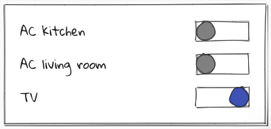
在 dashboard 配置中添加资源,URL 为 /local/wired-cards.js,类型为 module。
配置如下:
# Example dashboard configuration
views:
  - name: Example
    cards:
      - type: "custom:wired-toggle-card"
        entities:
          - input_boolean.switch_ac_kitchen
          - input_boolean.switch_ac_livingroom
          - input_boolean.switch_tv
图形化卡片配置
你的 card 可以定义 getConfigElement 方法,返回一个用于编辑用户配置的 custom element。Home Assistant 会在 dashboard 的 card editor 中显示该元素。
你的 card 还可以定义 getStubConfig 方法,以 json 形式返回默认 card 配置(不包含 type: 参数),供 card type picker 使用。
Home Assistant 会在初始化时调用配置元素的 setConfig 方法。
Home Assistant 会在状态变化时更新配置元素的 hass 属性,以及包含 dashboard 配置信息的 lovelace 元素。
配置变更会通过分发 config-changed 事件传回 dashboard,新配置位于其 detail 中。
要让 card 显示在 card picker dialog 中,请将描述它的对象添加到 window.customCards 数组。必需属性为 type 和 name(见下例)。
class ContentCardExample extends HTMLElement {
  static getConfigElement() {
    return document.createElement("content-card-editor");
  }

  static getStubConfig() {
    return { entity: "sun.sun" }
  }

  ...
}

customElements.define('content-card-example', ContentCardExample);
class ContentCardEditor extends LitElement {
  setConfig(config) {
    this._config = config;
  }

  configChanged(newConfig) {
    const event = new Event("config-changed", {
      bubbles: true,
      composed: true,
    });
    event.detail = { config: newConfig };
    this.dispatchEvent(event);
  }
}

customElements.define("content-card-editor", ContentCardEditor);
window.customCards = window.customCards || [];
window.customCards.push({
  type: "content-card-example",
  name: "Content Card",
  preview: false, // Optional - defaults to false
  description: "A custom card made by me!", // Optional
  documentationURL:
    "https://developers.home-assistant.io/docs/frontend/custom-ui/custom-card", // Adds a help link in the frontend card editor
});
使用内置表单编辑器
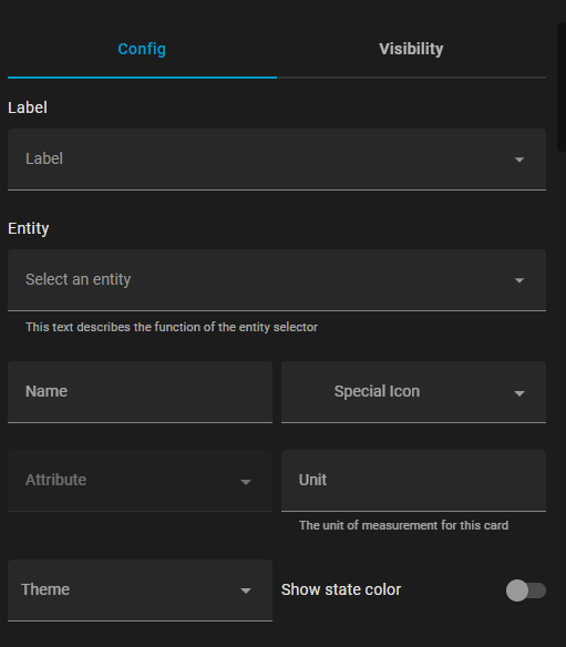
除了提供自定义 editor element,对于配置较简单的 cards,还可以使用前端内置表单编辑器。做法是在 card 类中定义静态 getConfigForm 函数,它返回一个 form schema,用于描述配置表单结构。
示例:
  static getConfigForm() {
    return {
      schema: [
        { name: "label", selector: { label: {} } },
        { name: "entity", required: true, selector: { entity: {} } },
        {
          type: "grid",
          name: "",
          schema: [
            { name: "name", selector: { text: {} } },
            {
              name: "icon",
              selector: {
                icon: {},
              },
              context: {
                icon_entity: "entity",
              },
            },
            {
              name: "attribute",
              selector: {
                attribute: {},
              },
              context: {
                filter_entity: "entity",
              },
            },
            { name: "unit", selector: { text: {} } },
            { name: "theme", selector: { theme: {} } },
            { name: "state_color", selector: { boolean: {} } },
          ],
        },
      ],
      computeLabel: (schema) => {
        if (schema.name === "icon") return "Special Icon";
        return undefined;
      },
      computeHelper: (schema) => {
        switch (schema.name) {
          case "entity":
            return "This text describes the function of the entity selector";
          case "unit":
            return "The unit of measurement for this card";
        }
        return undefined;
      },
      assertConfig: (config) => {
        if (config.other_option) {
          throw new Error("'other_option' is unexpected.");
        }
      },
    };
  }
该函数最多返回一个包含 4 个 key 的对象:
schema (required): schema 对象列表,每个表单字段一个,定义字段名称、selector 等属性。computeLabel (optional): 对每个字段调用,用于定义显示标签。若返回 undefined,Home Assistant 可能会对 entity 等通用字段使用已有翻译。computeHelper (optional): 对每个字段调用,用于定义显示在字段下方的辅助文本。assertConfig (optional): 每次配置更新时都会调用;若抛出 Error,可视化编辑器将被禁用。这可用于用户输入不兼容数据时禁用编辑器;后续若不再抛错,则会重新启用。
这个示例会生成如下配置表单:
表单 Schema 元素
表单 schema 可以包含单独控件、网格或扩展面板,常见选项如下:
控件:
name (required): 控件名称。selector (optional): 控件的 selector 配置(可用选项参见 selectors)type (optional): 若未定义 selector,可使用如 float、boolean 等原生类型,但更推荐 selectors。
网格:
type (required): gridname (required): 此 grid 在表单数据对象中的 key(见 flatten)schema (required): grid 中子控件列表flatten (optional): true/false,子控件数据是平铺到主字典,还是放入以 grid 名称命名的子字典column_min_width (optional): grid 单元格最小宽度的 CSS 值(例如 200px)
展开面板:
type (required): expandablename (required): 此面板在表单数据对象中的 key(见 flatten)schema (required): expansion panel 中子控件列表title (optional): 面板标题flatten (optional): true/false,子控件数据是平铺到主字典,还是放入以面板名称命名的子字典
这不是全部可用选项,更多配置见 ha-form/types.ts