import {
LitElement,
html,
css,
} from "https://unpkg.com/lit-element@2.0.1/lit-element.js?module";
const supportsButtonPressCardFeature = (stateObj) => {
const domain = stateObj.entity_id.split(".")[0];
return domain === "button";
};
class ButtonPressCardFeature extends LitElement {
static get properties() {
return {
hass: undefined,
config: undefined,
stateObj: undefined,
};
}
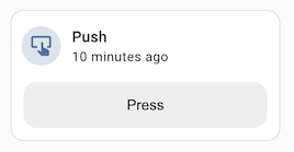
static getStubConfig() {
return {
type: "custom:button-press-card-feature",
label: "Press",
};
}
setConfig(config) {
if (!config) {
throw new Error("Invalid configuration");
}
this.config = config;
}
_press(ev) {
ev.stopPropagation();
this.hass.callService("button", "press", {
entity_id: this.stateObj.entity_id,
});
}
render() {
if (
!this.config ||
!this.hass ||
!this.stateObj ||
!supportsButtonPressCardFeature(this.stateObj)
) {
return null;
}
return html`
<button class="button" @click=${this._press}>
${this.config.label || "Press"}
</button>
`;
}
static get styles() {
return css`
.button {
display: block;
height: var(--feature-height, 42px);
width: 100%;
border-radius: var(--feature-border-radius, 12px);
border: none;
background-color: #eeeeee;
cursor: pointer;
transition: background-color 180ms ease-in-out;
}
.button:hover {
background-color: #dddddd;
}
.button:focus {
background-color: #cdcdcd;
}
`;
}
}
customElements.define("button-press-card-feature", ButtonPressCardFeature);
window.customCardFeatures = window.customCardFeatures || [];
window.customCardFeatures.push({
type: "button-press-card-feature",
name: "Button press",
supported: supportsButtonPressCardFeature, // Optional
configurable: true, // Optional - defaults to false
});