自定义卡片
Dashboards 是我们为你定义 Home Assistant 用户界面的方式。我们提供了许多内置卡片,但你并不仅限于我们决定纳入 Home Assistant 的那些。你可以构建并使用自己的卡片!
定义你的卡片
下面是一个展示可能性的基本示例。
在你的 Home Assistant config 目录中创建新文件 <config>/www/content-card-example.js,并放入以下内容:
class ContentCardExample extends HTMLElement {
  // card 连接到 DOM
  connectedCallback() {
    const event = new CustomEvent('context-request', {
      bubbles: true,
      composed: true,
      cancelable: true,
    });

    event.context = 'states'; // HA 的 user context provider 使用的 key
    event.subscribe = true; // 订阅此 context 的后续更新,而不只是获取当前值

    event.callback = this._updateStates;

    this.dispatchEvent(event);

    // 初始渲染
    this._render();
  }

  // 接收 states 更新并检查卡片是否需要重新渲染
  _updateStates = (states, unsubscribe) => {
    // 存储 unsubscribe 函数,以便在卡片从 DOM 中移除时调用
    this._unsubscribe = unsubscribe;

    const entityId = this.config.entity;
    console.log("update states", states, entityId)
    const state = states[entityId];
    const stateString = state ? state.state : "unavailable";
    console.log("stateString", stateString, this.stateString)
    if (this.stateString !== stateString) {
      console.log("stateString changed, re-rendering")
      this.stateString = stateString;
      this._render();
    }
  }

  // 仅在需要时渲染卡片的 html
  _render = () => {
    this.innerHTML = `
      ${this.config.entity || "?"} 的状态是 ${this.stateString || "unavailable"}!
      <br><br>
      <img src="http://via.placeholder.com/350x150">
    `;
  }

  // 用户提供的配置。抛出异常,Home Assistant
  // 将渲染一个 error 卡片。
  setConfig(config) {
    if (!config.entity) {
      throw new Error("You need to define an entity");
    }
    this.config = config;
  }

  // 你的卡片高度。Home Assistant 使用此值在 masonry view 中
  // 自动将所有卡片分配到可用的列中
  getCardSize() {
    return 3;
  }

  // 在 sections view 的 grid 中确定卡片大小的规则
  getGridOptions() {
    return {
      rows: 3,
      columns: 6,
      min_rows: 3,
      max_rows: 3,
    };
  }

  disconnectedCallback() {
    if (this._unsubscribe) {
      this._unsubscribe();
      this._unsubscribe = undefined;
    }
  }
}

customElements.define("content-card-example", ContentCardExample);
引用你的新卡片
在我们的示例卡片中,我们定义了一个带 tag content-card-example 的卡片(见最后一行),因此我们的卡片类型将是 custom:content-card-example。并且由于你将文件创建在 <config>/www 目录中,它将可以通过 /local/ URL 在你的浏览器中访问(如果你最近才添加 www 文件夹,需要重启 Home Assistant 才能加载文件)。
在你的 dashboard 配置中添加一个 resource,URL 为 /local/content-card-example.js,类型为 module(resource docs)。
然后你就可以在 dashboard 配置中使用你的卡片:
# 示例 dashboard 配置
views:
  - name: Example
    cards:
      - type: "custom:content-card-example"
        entity: input_boolean.switch_tv
API
Custom cards 被定义为 custom element。如何渲染你的 element 内部的 DOM 由你决定。你可以使用 Polymer、Angular、Preact 或其他任何主流框架(React 除外 – 更多信息请看这里)。
配置
Home Assistant 会在配置变更时(很少)调用 setConfig(config)。如果配置无效时你抛出异常,Home Assistant 会渲染一个 error 卡片来通知用户。
数据上下文
在示例中,你看到我们使用一个 custom event 来请求 Home Assistant 的 states。这是从 Home Assistant 获取数据并订阅此数据后续更新的推荐方式。详细文档请看这里。
在 masonry view 中的 sizing
你的卡片可以定义一个 getCardSize 方法,返回一个数字或一个将 resolve 为数字的 promise,代表你卡片的大小。高度为 1 相当于 50 像素。这将帮助 Home Assistant 在 masonry view 中将卡片均匀分配到各列。如果未定义该方法,将假定卡片大小为 1。
由于某些 element 可能会被 lazy load,如果你想获取另一个 element 的卡片大小,应首先检查它是否已定义。
return customElements
  .whenDefined(element.localName)
  .then(() => element.getCardSize());
在 sections view 中的 sizing
你可以定义一个 getGridOptions 方法,返回你卡片在 sections view 中使用的 grid 所占的最小、最大和默认单元格数量。每个 section 分为 12 列。如果你不定义此方法,卡片将占用 12 列,并忽略 grid 的 rows。
grid 中一个单元格的尺寸定义如下:
- width:section 宽度除以 12(约
30px)
- height:
56px
- 单元格间距:
8px
不同的 grid 选项包括:
rows:卡片占用的默认行数。如果想让卡片忽略 grid 的 rows,不要定义此值(默认未定义)min_rows:卡片占用的最小行数(默认为 1)max_rows:卡片占用的最大行数(默认未定义)columns:卡片占用的默认列数。设为 full 以强制卡片为全宽(默认为 12)min_columns:卡片占用的最小列数(默认为 1)max_columns:卡片占用的最大列数(默认未定义)
关于列数,非常建议使用 3 的倍数作为默认值(3、6、9 或 12),这样你的卡片在 dashboard 上默认会更美观。
实现示例:
public getGridOptions() {
  return {
    rows: 2,
    columns: 6,
    min_rows: 2,
  };
}
在此示例中,卡片默认将占用 6 x 2 个单元格。卡片高度不能小于 2 行。根据单元格尺寸,卡片高度将为 120px(2 * 56px + 8px)。
使用 JS modules 的示例
dashboard 中加载的 resources 是作为 JS module import 导入的。下面是一个使用 JS modules 的 custom card 示例,它实现了所有高级功能。
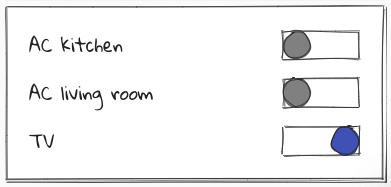
在你的 Home Assistant config 目录中创建新文件 <config>/www/wired-cards.js,并放入以下内容:
import "https://unpkg.com/wired-card@0.8.1/wired-card.js?module";
import "https://unpkg.com/wired-toggle@0.8.0/wired-toggle.js?module";
import {
  LitElement,
  html,
  css,
} from "https://unpkg.com/lit-element@2.0.1/lit-element.js?module";

function loadCSS(url) {
  const link = document.createElement("link");
  link.type = "text/css";
  link.rel = "stylesheet";
  link.href = url;
  document.head.appendChild(link);
}

loadCSS("https://fonts.googleapis.com/css?family=Gloria+Hallelujah");

class WiredToggleCard extends LitElement {
  static get properties() {
    return {
      hass: {},
      config: {},
    };
  }

  render() {
    return html`
      <wired-card elevation="2">
        ${this.config.entities.map((ent) => {
          const stateObj = this.hass.states[ent];
          return stateObj
            ? html`
                <div class="state">
                  ${stateObj.attributes.friendly_name}
                  <wired-toggle
                    .checked="${stateObj.state === "on"}"
                    @change="${(ev) => this._toggle(stateObj)}"
                  ></wired-toggle>
                </div>
              `
            : html` <div class="not-found">未找到 Entity ${ent}。</div> `;
        })}
      </wired-card>
    `;
  }

  setConfig(config) {
    if (!config.entities) {
      throw new Error("You need to define entities");
    }
    this.config = config;
  }

  // 你的卡片高度。Home Assistant 使用此值自动
  // 将所有卡片分配到可用的列中。
  getCardSize() {
    return this.config.entities.length + 1;
  }

  _toggle(state) {
    this.hass.callService("homeassistant", "toggle", {
      entity_id: state.entity_id,
    });
  }

  static get styles() {
    return css`
      :host {
        font-family: "Gloria Hallelujah", cursive;
      }
      wired-card {
        background-color: white;
        padding: 16px;
        display: block;
        font-size: 18px;
      }
      .state {
        display: flex;
        justify-content: space-between;
        padding: 8px;
        align-items: center;
      }
      .not-found {
        background-color: yellow;
        font-family: sans-serif;
        font-size: 14px;
        padding: 8px;
      }
      wired-toggle {
        margin-left: 8px;
      }
    `;
  }
}
customElements.define("wired-toggle-card", WiredToggleCard);
在你的 dashboard 配置中添加一个 URL 为 /local/wired-cards.js、类型为 module 的 resource。
以及你的配置:
# 示例 dashboard 配置
views:
  - name: Example
    cards:
      - type: "custom:wired-toggle-card"
        entities:
          - input_boolean.switch_ac_kitchen
          - input_boolean.switch_ac_livingroom
          - input_boolean.switch_tv
图形化卡片配置
你的卡片可以定义一个 getConfigElement 方法,返回一个用于编辑用户配置的 custom element。Home Assistant 将把这个 element 显示在 dashboard 的 card editor 中。
你的卡片还可以定义一个 getStubConfig 方法,以 json 形式返回一个默认的卡片配置(不含 type: 参数),供 dashboard 中的卡片类型选择器使用。
Home Assistant 将在设置时调用 config element 的 setConfig 方法。Home Assistant 会在状态变更时更新 config element 的 hass 属性,以及包含 dashboard 配置信息的 lovelace element。
配置的变更通过派发一个 config-changed 事件传回 dashboard,新配置包含在其 detail 中。
要让你的卡片显示在 dashboard 的卡片选择器对话框中,需要向数组 window.customCards 添加一个描述它的对象。该对象的必填属性为 type 和 name(见下面示例)。
class ContentCardExample extends HTMLElement {
  static getConfigElement() {
    return document.createElement("content-card-editor");
  }

  static getStubConfig() {
    return { entity: "sun.sun" }
  }

  ...
}

customElements.define('content-card-example', ContentCardExample);
class ContentCardEditor extends LitElement {
  setConfig(config) {
    this._config = config;
  }

  configChanged(newConfig) {
    const event = new Event("config-changed", {
      bubbles: true,
      composed: true,
    });
    event.detail = { config: newConfig };
    this.dispatchEvent(event);
  }
}

customElements.define("content-card-editor", ContentCardEditor);
window.customCards = window.customCards || [];
window.customCards.push({
  type: "content-card-example",
  name: "Content Card",
  preview: false, // 可选,默认为 false
  description: "A custom card made by me!", // 可选
  documentationURL:
    "https://developers.home-assistant.io/docs/frontend/custom-ui/custom-card", // 在 frontend 卡片编辑器中添加帮助链接
});
为实体推荐你的卡片
自 Home Assistant 2026.6 起可用。
当用户在卡片选择器中选择一个实体时,Home Assistant 会显示适用于该实体的建议卡片列表。你的卡片可以在其 window.customCards 条目中定义 getEntitySuggestion 函数来加入此列表。建议的 custom cards 会出现在内置建议下方的 Community 部分。
window.customCards.push({
  type: "content-card-example",
  name: "Content Card",
  getEntitySuggestion: (hass, entityId) => {
    // 如果不支持该实体,返回 null
    const domain = entityId.split(".")[0];
    if (domain !== "light") {
      return null;
    }
    // 返回一个建议
    return {
      config: { type: "custom:content-card-example", entity: entityId },
    };
  },
});
getEntitySuggestion(hass, entityId) 会被传入 hass 对象和所选 entity id。它返回:
- 如果卡片不支持该实体,返回
null。
- 单个建议,或一个建议数组,用于提供多种变体。
仅当你的卡片对该实体确实有意义时才返回建议。使用 hass 对象检查其实体的 domain、device class 或 supported features。为每个实体都推荐你的卡片会让选择器过于杂乱,并导致用户选择错误的卡片。
每个建议都是一个对象,包含:
config (必填):用户选择该建议时要应用的卡片配置。必须包含你的 type(带 custom: 前缀)。label (可选):描述变体的简短标签。选择器会先显示卡片的 name,再接这个 label,因此只有返回多个建议时才设置它。
getEntitySuggestion: (hass, entityId) => {
  if (entityId.split(".")[0] !== "light") {
    return null;
  }
  return [
    {
      label: "Compact",
      config: { type: "custom:content-card-example", entity: entityId },
    },
    {
      label: "Detailed",
      config: {
        type: "custom:content-card-example",
        entity: entityId,
        details: true,
      },
    },
  ];
},
使用内置表单编辑器
为图形编辑器配置的一种方式是为卡片提供一个 custom editor element;对于配置需求相对简单的卡片,另一种选择是使用内置的 frontend 表单编辑器。通过在卡片类中定义一个静态 getConfigForm 函数来实现,它返回一个定义配置表单形状的 form schema。
示例:
  static getConfigForm() {
    return {
      schema: [
        { name: "label", selector: { label: {} } },
        { name: "entity", required: true, selector: { entity: {} } },
        {
          type: "grid",
          name: "",
          schema: [
            { name: "name", selector: { text: {} } },
            {
              name: "icon",
              selector: {
                icon: {},
              },
              context: {
                icon_entity: "entity",
              },
            },
            {
              name: "attribute",
              selector: {
                attribute: {},
              },
              context: {
                filter_entity: "entity",
              },
            },
            { name: "unit", selector: { text: {} } },
            { name: "theme", selector: { theme: {} } },
            { name: "state_color", selector: { boolean: {} } },
          ],
        },
      ],
      computeLabel: (schema) => {
        if (schema.name === "icon") return "Special Icon";
        return undefined;
      },
      computeHelper: (schema) => {
        switch (schema.name) {
          case "entity":
            return "This text describes the function of the entity selector";
          case "unit":
            return "The unit of measurement for this card";
        }
        return undefined;
      },
      assertConfig: (config) => {
        if (config.other_option) {
          throw new Error("'other_option' is unexpected.");
        }
      },
    };
  }
从此函数中,应返回一个最多包含 4 个 key 的对象:
schema (必填):这是一个 schema 对象列表,每个表单字段对应一个,定义字段的名称、selector 等各种属性。computeLabel (可选):此回调函数会对每个表单字段调用,允许卡片定义要显示的字段 label。如果为 undefined,Home Assistant 可能会为 entity 这类通用字段名应用已知的翻译,或者你也可以提供自己的翻译。computeHelper (可选):此回调函数会对每个表单字段调用,允许你为字段定义更长的 helper 文本,将显示在字段下方。assertConfig (可选):每次配置更新时,用户的配置都会传递给此回调函数。在此回调中抛出 Error 将使可视化编辑器被禁用。这可用于在用户输入不兼容数据时禁用可视化编辑器,比如对期望 string 的 selector 输入了一个 yaml 对象。如果此回调的后续执行未抛出错误,可视化编辑器将被重新启用。
此示例将产生以下配置表单:
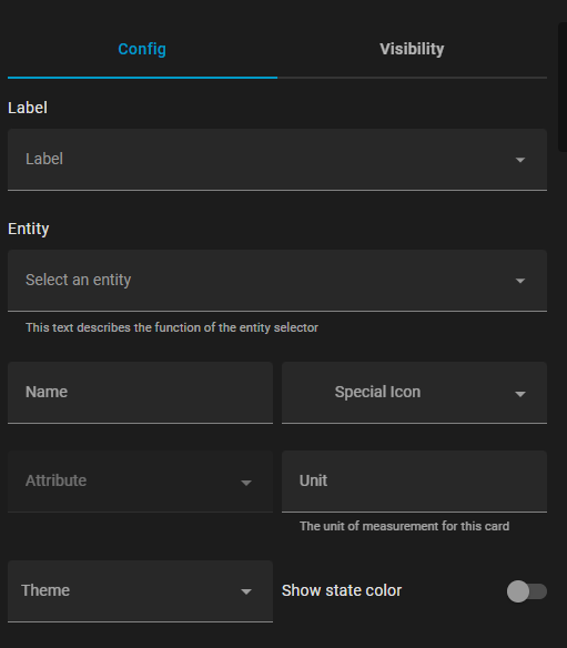
form schema 可以包含独立的控件、grid 或 expansion panel,配置选项如下:
Controls:
name (必填):控件的名称。selector (可选):此控件的 selector 配置(可用选项请参见 selectors)type (可选):如果未定义 selector,有 float 和 boolean 等原生表单类型,但建议使用 selectors。
Grids:
type (必填):gridname (必填):在 form 数据对象中对应此 grid 的 key(参见 flatten)schema (必填):grid 中子控件的列表flatten (可选):true/false,指示子控件数据是否应展平到主数据字典中,还是放在以此 grid 命名的子字典下column_min_width (可选):grid 中单元格最小宽度的 CSS 属性(例如 200px)
Expansion Panel:
type (必填):expandablename (必填):在 form 数据对象中对应此 panel 的 key(参见 flatten)schema (必填):expansion panel 中子控件的列表title (可选):panel 上的标题flatten (可选):true/false,指示子控件数据是否应展平到主数据字典中,还是放在以此 panel 命名的子字典下
这不是所有选项的完整列表,更多配置选项列于 ha-form/types.ts